ANDREAS GYSIN: DESCENT
Part of a series of articles & interviews released digitally that were first published in the print edition of the Bright Moments Quarterly that was distributed at Bright Moments Paris in Paris, France in February, 2024.
Bright Moments: Thank you for taking the time to do this interview, Andreas! Could you tell us more about your background and how you got started with generative art?
Andreas Gysin: Hello, and thank you for having me. I’m a graphic designer by trade. During my school years, between 1995 and 2000, I was fascinated with the idea of creating images beyond the capabilities of traditional design tools like drawing, painting, sketching, and even standard computer-aided design. This curiosity led me to explore coding as a medium for generating unique imagery. As I delved deeper, I started experimenting with animations and various forms of digital expression. This laid the foundation for my journey into generative art.
Could you tell us more about ASCII art? It’s not often we see artists focusing solely on ASCII. Its raw, minimalist nature is fascinating and I find the beautiful art created from it intriguing.
Absolutely. ASCII art is part of a long tradition that encompasses not just ASCII, but also text art and typewriter art. This tradition predates computers, as with the typewriter art I’ve just mentioned. My fascination began with the early demos and intros from the Demoscene. These were often accompanied by a text file which included credits, information, and also some kind of ASCII art. This was the sort of imagery I was exposed to in the past.
I began experimenting, not with pure ASCII art, but with text—text in motion, text synchronized to sound. It was interesting to see what happened in a real-time fashion, the immediate feedback of what was happening between the image and the code. When I ventured into NFTs, I decided to delve deeper into this domain. I set certain constraints for myself as a guide, limiting my scope to work primarily in this area. It was not about doing whatever I wanted but about concentrating within this specified spectrum.
That said, I also disobeyed my own rules and deviated from the constraints I have set on myself, but that's another story.

I guess that's just part of being an artist. What are you currently keen on exploring in your creative career? What are your main inspirations at the moment?
My work often involves juggling multiple projects at once, some in collaboration with my partner, Sidi Vanetti. We are exploring different directions, and there is always a tangible, hardware or physical component to our practice. We like to start with a specific object or technology, and then build the project around it. So, there are many such projects in progress.
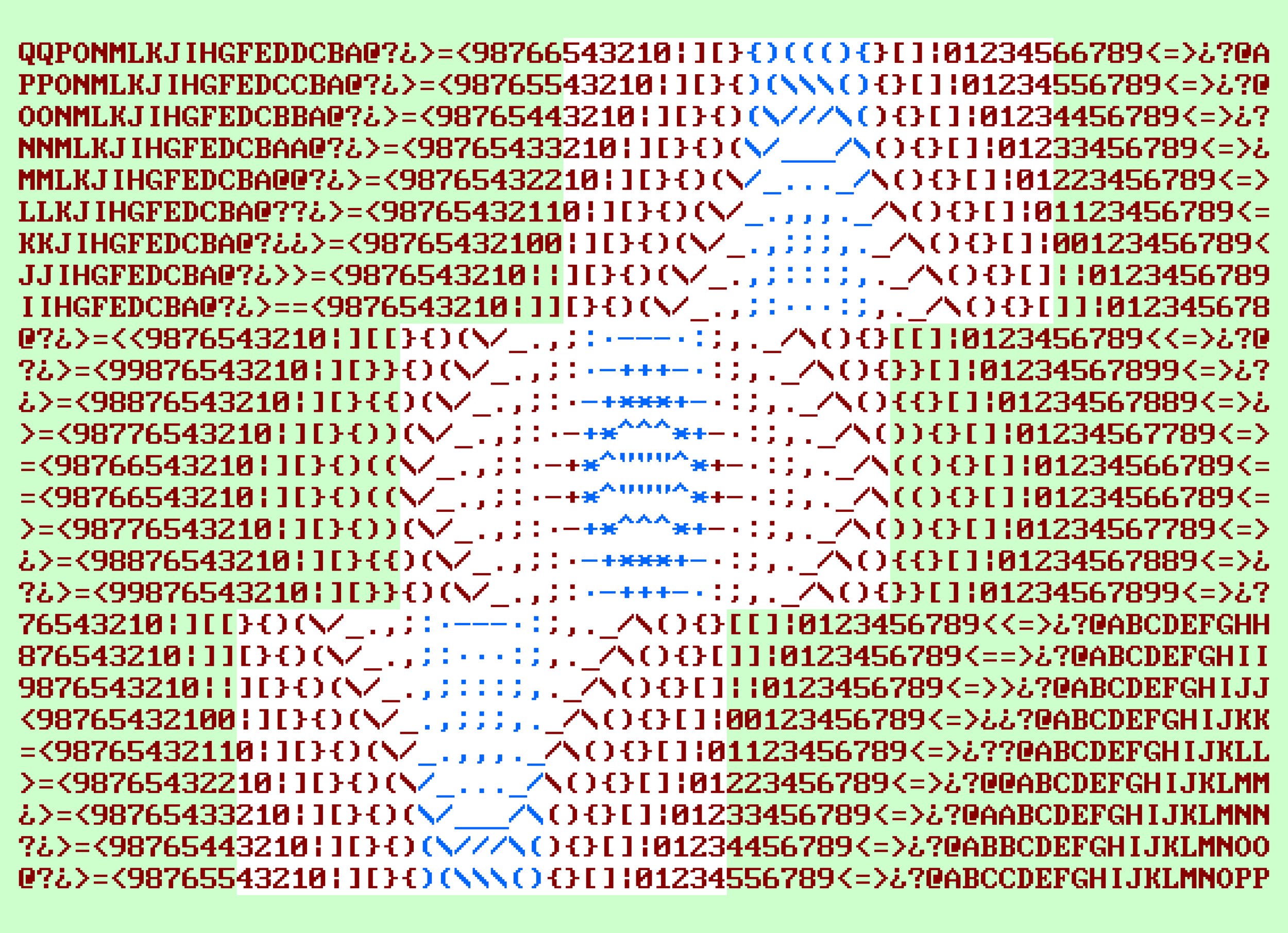
On the software side or the ASCII or text mode side, I'm currently delving into creating a sense of depth in my work. It’s not about achieving a three-dimensional representation on a completely flat surface, but about giving a sense of or suggesting volume. This aspect is interesting to me because I don’t rely on any sort of 3D algorithms or systems; the effect is achieved by merely scaling values and shading specific parts of the image in a particular way, through which a sense of depth emerges. That’s a theme I’m quite engaged with at the moment, but really I want to stop before it becomes too three-dimensional.
Okay, very interesting. There are two points from your response that align with my questions. First, about the strong relationship in your work between hardware and software, particularly in projects like 64 pixels and LCD 1. These projects have corresponding, proper hardware and very minimalistic and raw pieces of art. Could you tell us more about them? In a second question, I will touch on the 3D aspect you just mentioned which seems more related to your current work.
Yes, the hardware-software integration is a key part of our work, which I mostly do with Sidi. There are a few pieces I handle on my own, but they’re a smaller part of our overall production. I see our approach in two categories:
First, we work with existing hardware that we’ve come across. This hardware typically already has a designated purpose in a certain context, like a communication device. It has its own life, designed for a specific function. Tackling projects with this type of hardware is fascinating because it requires an understanding of the object—its display, limitations—and then developing a project around it.
The second category is a little bit more open, like our work on 64 pixels with Sidi or my solo project LCD 1. Here, the display or the hardware is a bit more multipurpose and generic. The hardware used is already a sort of display without specific content designed for it. However, these kinds of displays have their own characteristics and limitations, such as the very low resolution for 64 pixels or black and white only constraint for LCD 1. It's always an interesting challenge to conceive ideas or concepts that embrace these sorts of limitations.

In the cases you’ve described, 64 Pixels and LCD 1, both have screens. But what about the first kind of hardware you mentioned, which isn’t necessarily designed for art? Do they have screens, or are they pieces of hardware linked to larger screens?
It depends. For instance, in the case of XXX, Sidi and I used pharmacy crosses. These crosses already have a certain visual language and have a specific purpose, but in a way, they can be considered a type of display. What we did was tilt them by 45 degrees, transforming them from crosses to “X”s. We also wrote custom software for this project. Another example is the small alphanumeric split-flap elements that we used in Six Letters, which you can find in train stations or airports.
These older pieces of hardware can indeed be seen as displays each of them has unique characteristics, speeds, and use cases. Working with these older hardware pieces can be challenging because they are found in different contexts. Acquiring them is not always easy and they usually don't come with a manual. So, we also need to figure out how to reprogram and make them functional again. This presents another set of challenges that comes with working with such hardware.
It’s challenging, but I find it fascinating how you repurpose old pieces that were not originally made for art, redirecting their purpose to create very contemporary art. It’s superb. Regarding the second part of your previous answer, you mentioned exploring “flat 3D shapes,” or perhaps that's not the right terminology. Could you tell us more? It seems to be at the heart of what you're working on for Bright Moment Paris.
It’s not my first time exploring this direction. I tread 3D with caution as I’m not aiming to create images that are so clear in terms of depth and volume that they approach the realm of photorealism. My background is rooted in 2D design, working with paper and print, which influences my perspective. When I incorporate 3D or depth, I deliberately keep it subtle. I wouldn’t even call it “true” 3D; it’s more like experimenting with volume and perception.
When combining these elements with text, it's paradoxical because text is inherently flat on a page. So the question becomes, how can I create a sense of depth or layers in this domain? There are several techniques. For a recent project I did at Funkhaus (with AGH), I used a technique involving minimal shading, but the main effect was achieved through motion. The motion itself conveys a sense of 3D, and a bit of shading adds to the illusion, even though there's no 3D rendering involved. It's essentially a fake 3D created specifically for that project.
In the case of the project I’m currently working on for Bright Moments, which is still untitled, I’m more interested in axonometry—a simple perspective. By combining glyphs in a particular way, you can still convey a sense of depth and volume all through characters.
A quick side note: This has been done before. There is a famous demo called donut.c by a1kon, a virtuous coder who uses shading techniques in ASCII art. So it basically involves a path tracer to create perfect shadows and reflections on a geometric shape, a donut. It’s entirely possible to achieve a convincing representation of depth and light in ASCII art, but that's not what I'm after. I'm really aiming for a flatter style.
That’s super interesting. So, regarding the technique you mentioned, such as shading, are there other methods in ASCII art, like using bold type fonts to increase thickness or experimenting with different tools or approaches?
It really depends on how you define ASCII art and how “pure” you want to stay in your approach. Of course, you have the freedom to do whatever you like. Personally, when I work with text, I aim to stick within the grid. I don't move characters outside of the grid and I don't use different weights like bold or light, nor do I vary the sizes. The grid remains complete and fixed, with only characters in motion. Occasionally, I introduce color, which is a deviation from “pure” ASCII art, but these are the main constraints I follow as a guide. I try to adhere to these principles.